Enhancing Web Accessibility: Or why I changed my website's font
2 min read
287 words
As someone with visual impairment in one eye, I understand firsthand the challenges of navigating websites with less-than-perfect vision. That's why I recently made a significant change to my website: I switched to the Atkinson Hyperlegible Font.
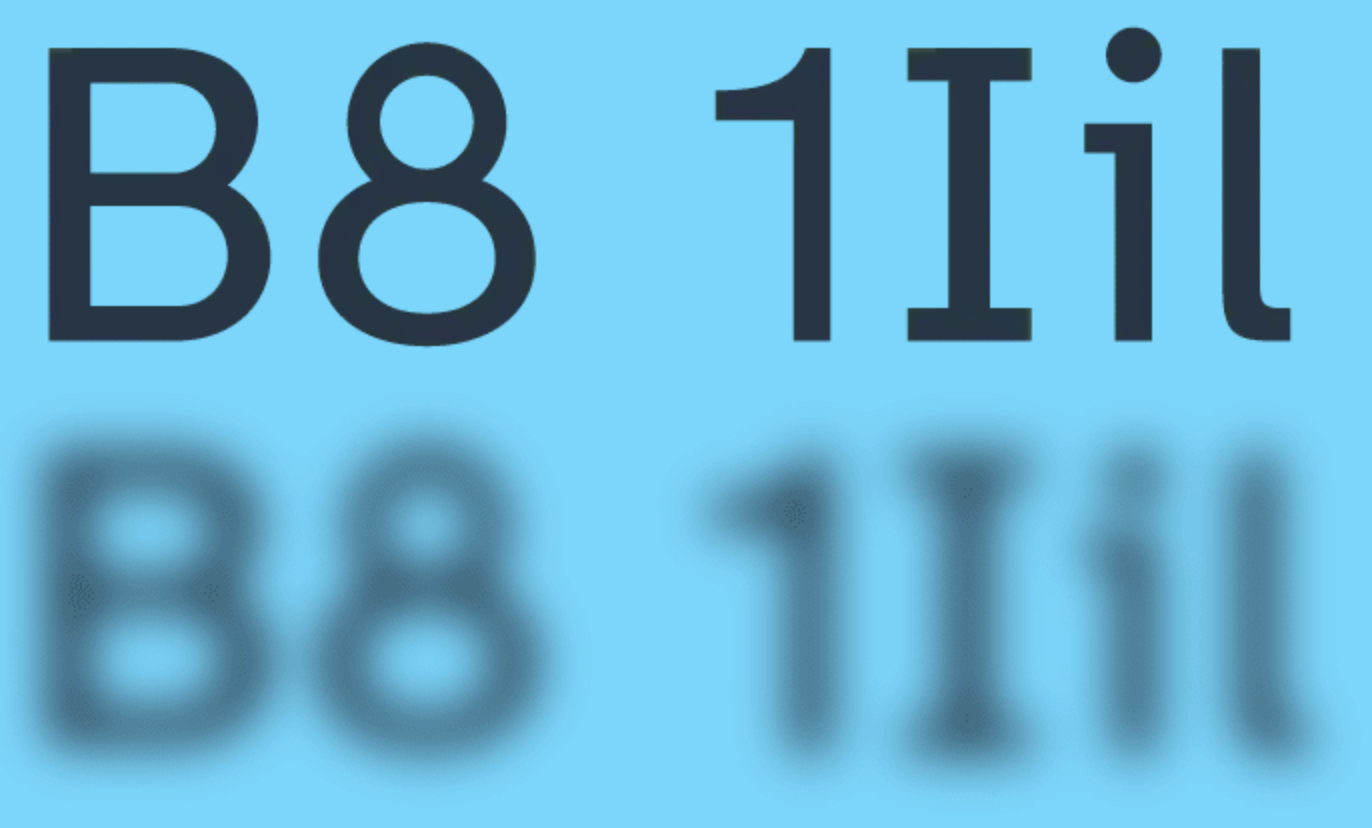
Atkinson Hyperlegible Font is a typeface designed to enhance readability for people with visual impairments. Created by the Braille Institute, this font addresses common issues that make reading difficult for those with low vision.
Switching to Atkinson Hyperlegible Font was a small change with a hopefully big impact. It has improved the readability of my website while maintaining a modern look.
Why I Made the Switch
- Improved Readability: The font's design makes it easier to distinguish between similar characters, reducing confusion and eye strain.
-
Modern Aesthetic: Despite its focus on functionality, Atkinson Hyperlegible doesn't sacrifice style. It has a clean, contemporary look that fits well with modern web design trends.
-
Personal Connection: Having experienced visual challenges myself, I'm committed to making my content accessible to as many people as possible.
The Importance of Web Accessibility
Many websites overlook accessibility features, unintentionally excluding a significant portion of their potential audience. While my site may not be perfect, striving for better accessibility is crucial. It's not about compliance; it's about creating an inclusive online environment where everyone can access information comfortably.
My Previous Font Choice
Before discovering Atkinson Hyperlegible, I was using Fixel. While Fixel is a great font in its own right, I found that Atkinson Hyperlegible better suited my accessibility goals without compromising on style.
Thank you for reading, have a wonderful day
Niklas